# python作图
python有很多作图函数,比如Matplotlib,还有pandas绘图,现在来熟悉下这些函数。
# Matplotlib
Matplotlib库受Matlab启发,是面向过程的,可绘制各种图,其中有两种主要概念:
- Figure(面板):matplotlib中的所有图像均位于面板中,一个图像只能有一个figure。
- Subplot(子图):面板下创建一个或多个subplot对象用于绘制图像。
下面是基本操作:
import matplotlib.pyplot as plt
#%matplotlib inline # 这行必不可少
import numpy as np
import math
divideNum=60
x1 = np.linspace(0,360*math.pi/180,divideNum)
x2 = np.linspace(0,360,divideNum)
# 画出sin
y= np.sin(x1)
plt.plot(x2,y)
# 同时画出cos
plt.plot(x2,np.cos(x1))
# 用虚线画
plt.plot(x2,y+0.5,'--')
# 把画的图保存为一个图片
fig = plt.figure()
plt.plot(x2,y,'--')
fig.savefig('firstImage.png')
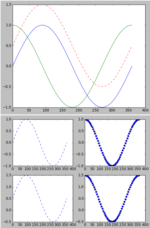
# 同时画四张图
plt.subplot(2,2,1)
plt.plot(x2,np.sin(x1),'--')
plt.subplot(2,2,2)
plt.plot(x2,np.cos(x1),'o')
plt.subplot(2,2,3)
plt.plot(x2,np.sin(x1)+0.5,'--')
plt.subplot(2,2,4)
plt.plot(x2,np.cos(x1)+0.5,'o')
1
2
3
4
5
6
7
8
9
10
11
12
13
14
15
16
17
18
19
20
21
22
23
24
25
26
27
28
29
30
31
32
2
3
4
5
6
7
8
9
10
11
12
13
14
15
16
17
18
19
20
21
22
23
24
25
26
27
28
29
30
31
32
修改一下外面的样式:
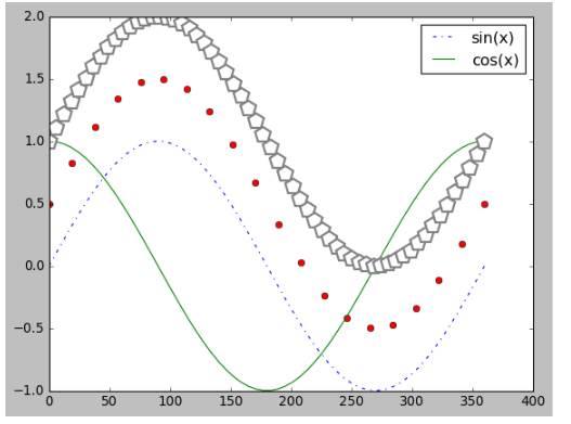
# 画点
x3= np.linspace(0,360*math.pi/180,20)
x4= np.linspace(0,360,20)
plt.plot(x4,np.sin(x3)+0.5,'o',color='red')

# 显示lable
plt.plot(x2,np.sin(x1),'-.',label='sin(x)')
plt.plot(x2,np.cos(x1),'-',label='cos(x)')
#legend 控制label的显示效果,loc是控制label的位置的显示
plt.legend(loc=1)

# 用五边形来画图
plt.plot(x2,np.sin(x1)+1,'p',color='gray',markersize=15,linewidth=4,markerfacecolor='white',markeredgecolor='gray',markeredgewidth=2)
1
2
3
4
5
6
7
8
9
10
11
12
13
2
3
4
5
6
7
8
9
10
11
12
13
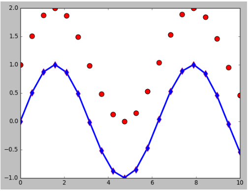
画折线图,并限制x,y的长宽:
#画折线图
x = np.linspace(0,10,20)
y = np.sin(x)
plt.plot(x,y,'-d',color='blue',markersize=10,linewidth=3,markeredgecolor='red')
plt.ylim(-1,2)
plt.xlim(0,10)

# 画散点图
plt.scatter(x,y+1,s=100,c='red')
1
2
3
4
5
6
7
8
9
2
3
4
5
6
7
8
9
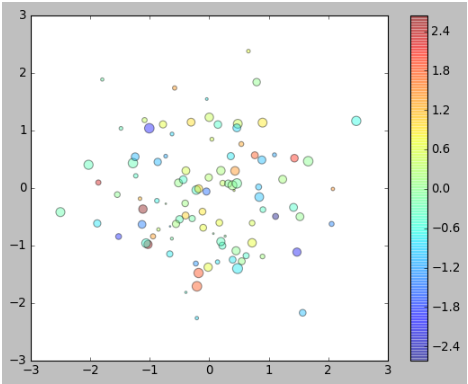
画二维的散点图:
plt.style.use('classic')
x=np.random.randn(100)
y=np.random.randn(100)
colors=np.random.randn(100)
sizes=100*np.random.rand(100)
plt.scatter(x,y,c=colors,s=sizes,alpha=0.4)
plt.colorbar()
1
2
3
4
5
6
7
2
3
4
5
6
7
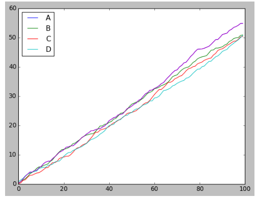
# Pandas画图
绘制线形图:
# 绘制线形图
import pandas as pd
df = pd.DataFrame(np.random.rand(100,4).cumsum(0),columns=['A','B','C','D'])
df.plot()
## 绘制其中一列
df.A.plot()
1
2
3
4
5
6
2
3
4
5
6
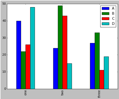
绘制柱状图:
# 绘制柱状图
df = pd.DataFrame(np.random.randint(10,50,(3,4)),columns=['A','B','C','D'],index=['one','two','three'])
df.plot.bar()
## df.plot(kind='bar')
## df.plot(kind='bar',stacked='true')
## 绘制其中一列
# df.A.plot.bar()
1
2
3
4
5
6
7
2
3
4
5
6
7
绘制直方图:
直方图反映的是一组数据的分布情况。
df = pd.DataFrame(np.random.randn(100,4),columns=['A','B','C','D'])
df.hist()
# 绘制其中一列
#df.hist(column='A',figsize=(30,20))
1
2
3
4
2
3
4

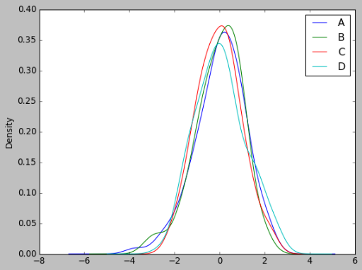
绘制密度图:
密度图可以了解到数据分布的密度情况。
df.plot.kde()
1